Contact us
Let’s setup a Conversation
Let’s design experiences
that lead the way.
The rise of social media, consumerization of technology and growth in digital communities has given tools and confidence for communities to assert and celebrate their identities. Digitally, it has manifested in the growth of community commerce globally.
The key is first to understand community – it is a social unit of people with commonality such as norms, religion, values, customs, or identity. Communities may share a geographical area or virtual / digital space or even spiritual space.
While eCommerce is oriented around direct selling to buyers through digital traction, social commerce revolves around convenience and entertainment. Community commerce focuses on the people. It aims at building connection and trust among members of the community. Community commerce, in that sense, facilitates exchange of goods or services based on the currency of ‘Trust’ between people supplying them and the ones consuming within the community.

JusHalal was envisioned to serve the young muslim consumer needs. The brand had done market research and identified, mapped and outlined latent needs of the audience, which in spite of various choices, remained unserved. The aspiration was to position the brand to address these community-centric needs. Keeping true to the essence of halal, the platform wanted to provide lifestyle discovery and choices which were modern, aspirational yet complied with the cultural code. In that sense, JusHalal was attempting to build the first digital community commerce platform by marrying the spiritual values with consumerist aspirations. One of the key criteria was to be ethical and considerate.
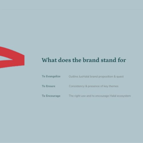

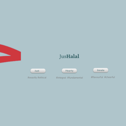
The objective of JusHalal brand is to establish trust and distinctness. And to empower the community members to discover new lifestyle goods and foods that comply with the code. Thereby provide ease of mind by inspiring trust and give a fillip to the community commerce.


The logo vision grew out of the Urdu alphabet, the letter ‘Hey’ which is easily identifiable as a visual identifier and intuitively evoked as a seal of trust.
The visual manifestation took the cue from the vision and blended the Urdu / Arabic letter ‘Hey’ with standard English typography to form a fused identity that capture the aspiration of a modern, urban young Muslim.
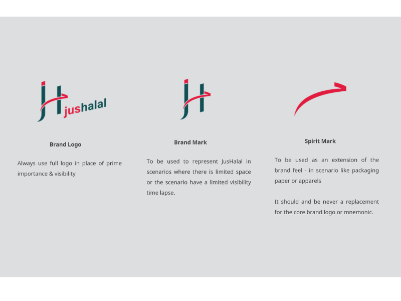
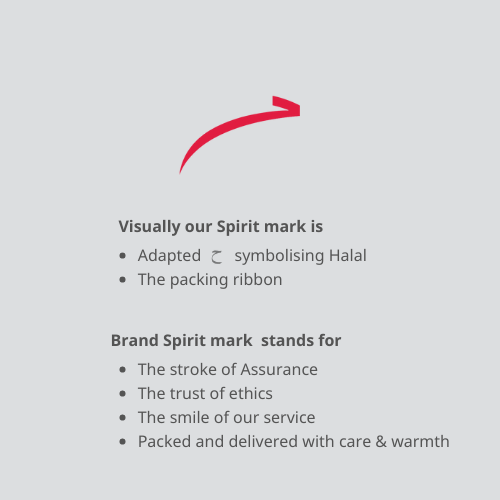
The visual identity blended the Arabica, Urdu and European language typographical elements to formed a unit, held together by the stroke of assurance. It is also, in its own way, a smile of the service and the mark of a unique business ethic.
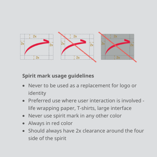
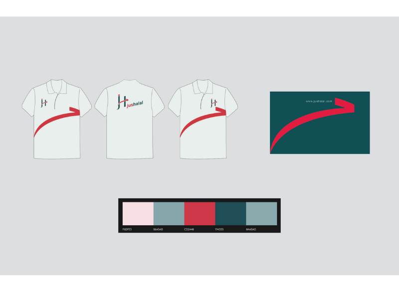
The stroke of assurance was designed to be the brand visual identifier and is to be used across packaging and consumer facing brand interfaces – both physical and digital. It is to be used as an extension of the brand feel – in scenarios like packaging paper, staff uniform and delivery vehicles – a mark representing community cultural ethics and distinctive in a crowd.

Contact us
Let’s design experiences
that lead the way.
HUDE Studio designs with data and empathy, crafting seamless experiences across branding, marketing, and digital. Focused on Customer Experience (CX), we go beyond UX to create impact-driven solutions.


